
NYC Audubon
The rebrand and website redesign equipped NYC Audubon with a bold new look and platform to realize the ambitions of their new five-year Strategic Plan.
My role
I successfully managed the entire project lifecycle, from the initial discovery and research phase to the final conceptual design and delivery. I ensured all project goals and objectives were met within established timelines and budgets.
Completed during my tenure at Reit Design.
Opportunity
As the NYC Audubon's 40th anniversary loomed on the horizon, they realized the pressing need to revamp their brand and website to enhance their visibility, engagement, and fundraising initiatives - especially among younger audiences.
Their current brand appearance was outdated, and the website was difficult to navigate, unresponsive on mobile devices, and inadequate to meet the organization's evolving requirements. With an ambitious five-year strategy about to take off, the organization aimed to obtain the necessary resources to convey its vision of establishing an unparalleled leadership position in New York City's conservation landscape.
Approach
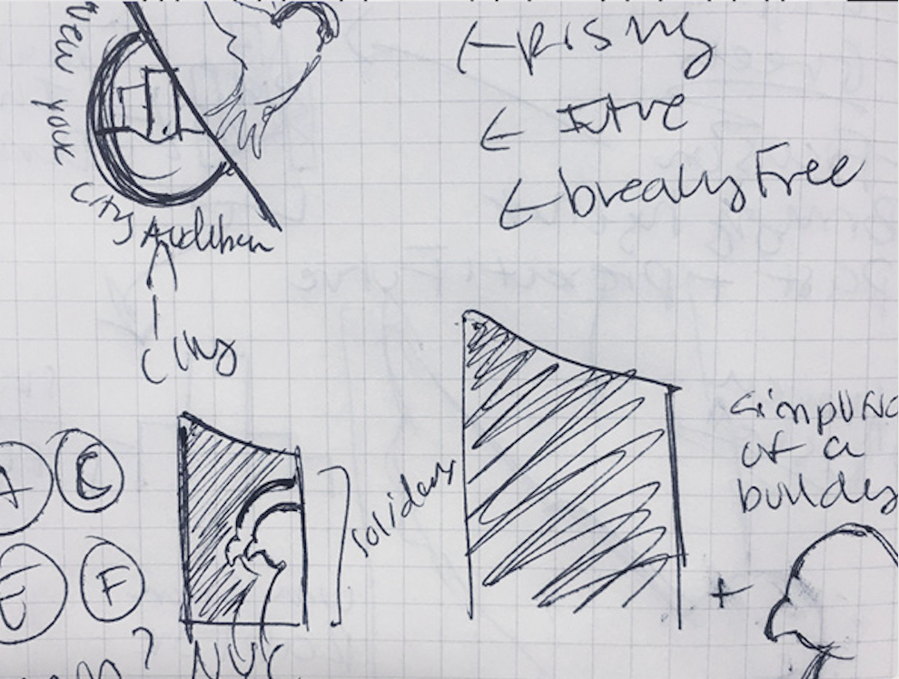
The initial focus was on conducting extensive research on brand, communication, and competition to comprehend the conservancy landscape and guarantee a distinctive positioning relative to similar organizations, most notably New York Audubon.
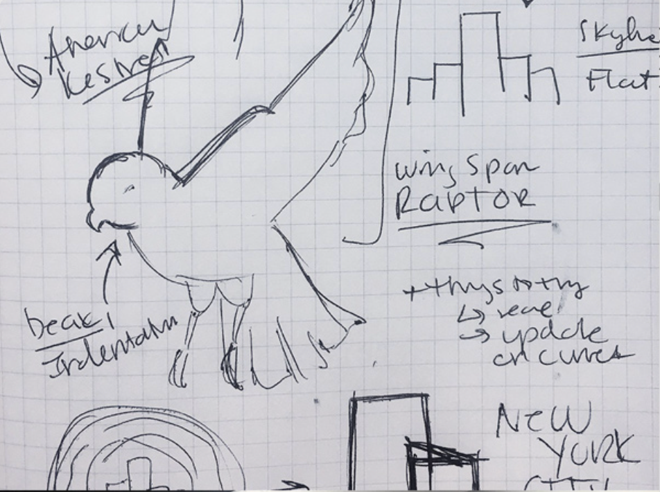
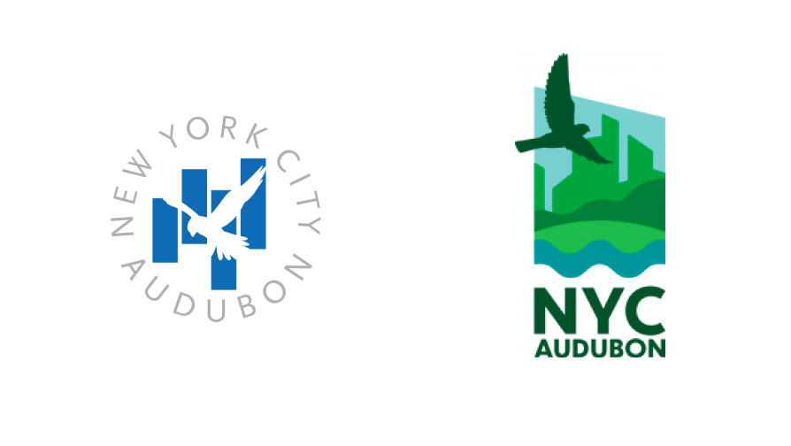
Although the previous brand identity with the American Kestrel logo was popular, it was time to adopt a fresh approach to signify a new era of growth and leadership. Hence, the organization sought to incorporate a soaring raptor as its signature graphic. By combining the key elements - the raptor, New York City's iconic skyline, and green spaces - I was able to establish a visually compelling identity that reflects a strong sense of place and purpose.
Solution
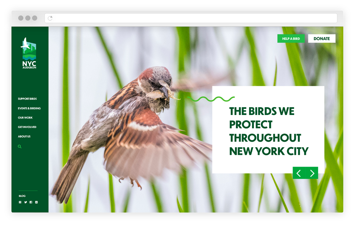
The original logo's bird silhouette and vertical shapes were honored with a unique emblem of a soaring raptor over the iconic New York City skyline, as viewed from a city park.
To signify conservancy, the color palette was updated to include warm greens and blues, and a modern, bold typeface was selected to enhance legibility significantly.
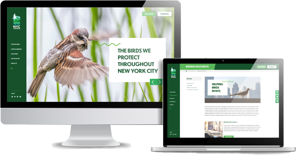
A clear and purposeful brand structure was established, utilizing typography, color, photography, and graphic elements to build an effective brand system that can be used across all mediums. Finally, the brand was brought to life by developing a bold and user-friendly website, effectively accomplishing critical strategic objectives.
Bringing it all together
A clear, consistent, and compelling message was delivered by simplifying the organization's existing content and program display. An advanced content management system enabled effortless updates and additions, while integration with fundraising and CRM systems ensured seamless marketing, programming, and fundraising across all mission areas.
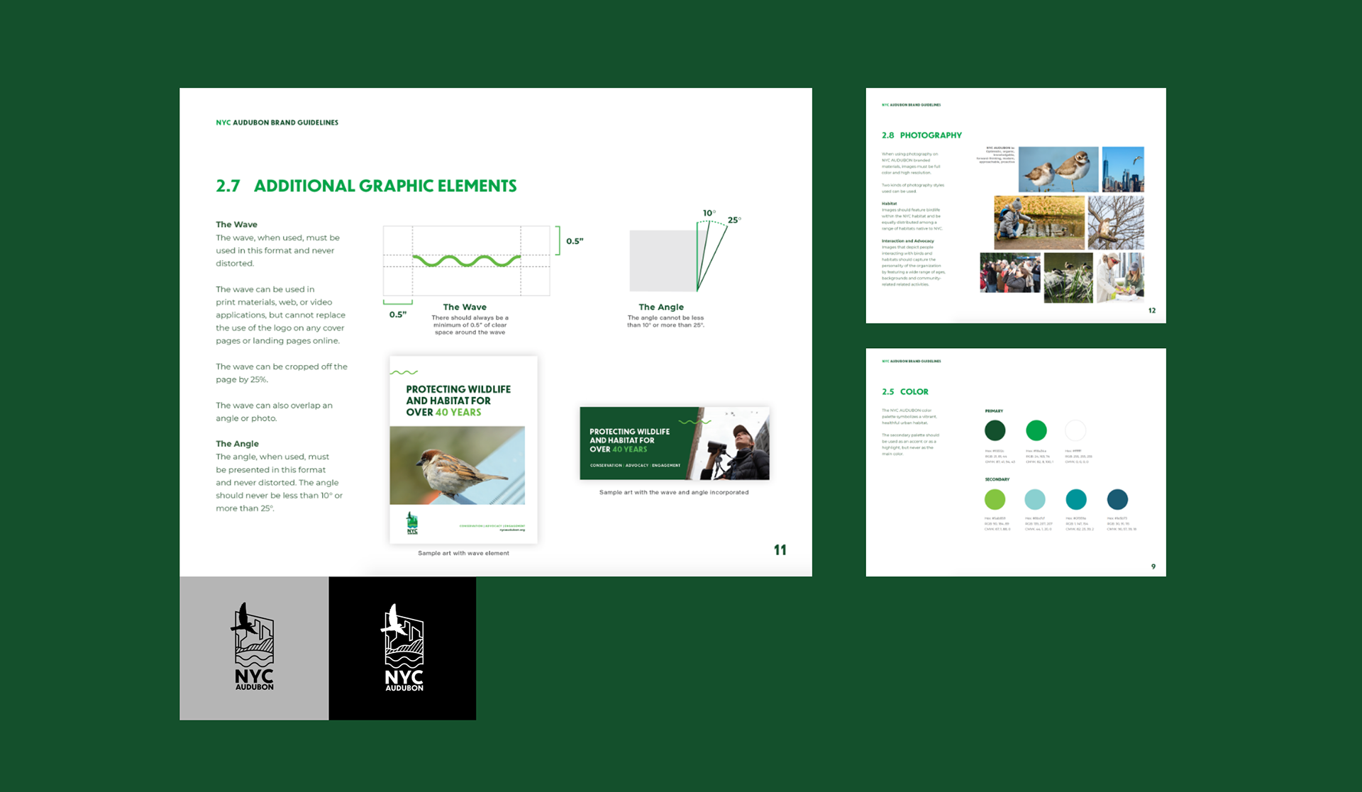
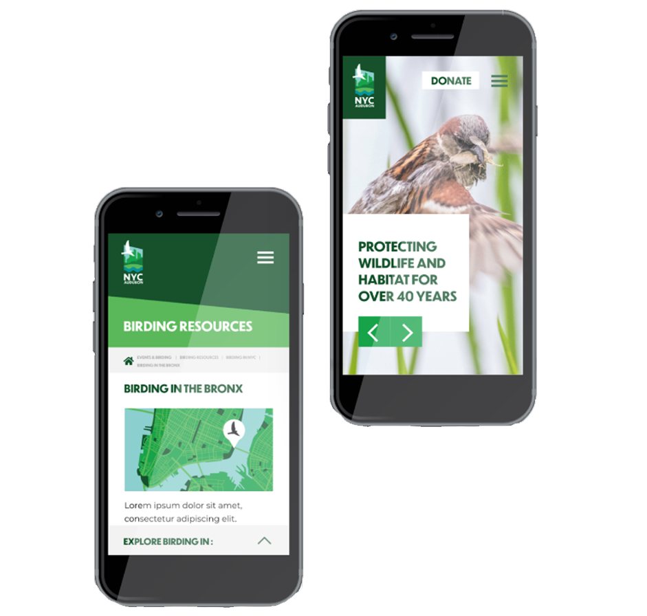
Scalable and transparent design for web, social media, and marketing
The design for scalability and understanding produced a straightforward and flexible system for the organization's online presence. A responsive website design was developed to ensure seamless viewing across desktop, tablet, and mobile devices. Graphics were also created for social media, fundraising, and marketing to maintain clarity and consistency across all communications.