ENTRADA
ENTRADA has defined its position as an agent of change, innovation, and the go-to partner to solve the most complex market challenges. They now needed a visual identity that communicated these values upfront.
The concept
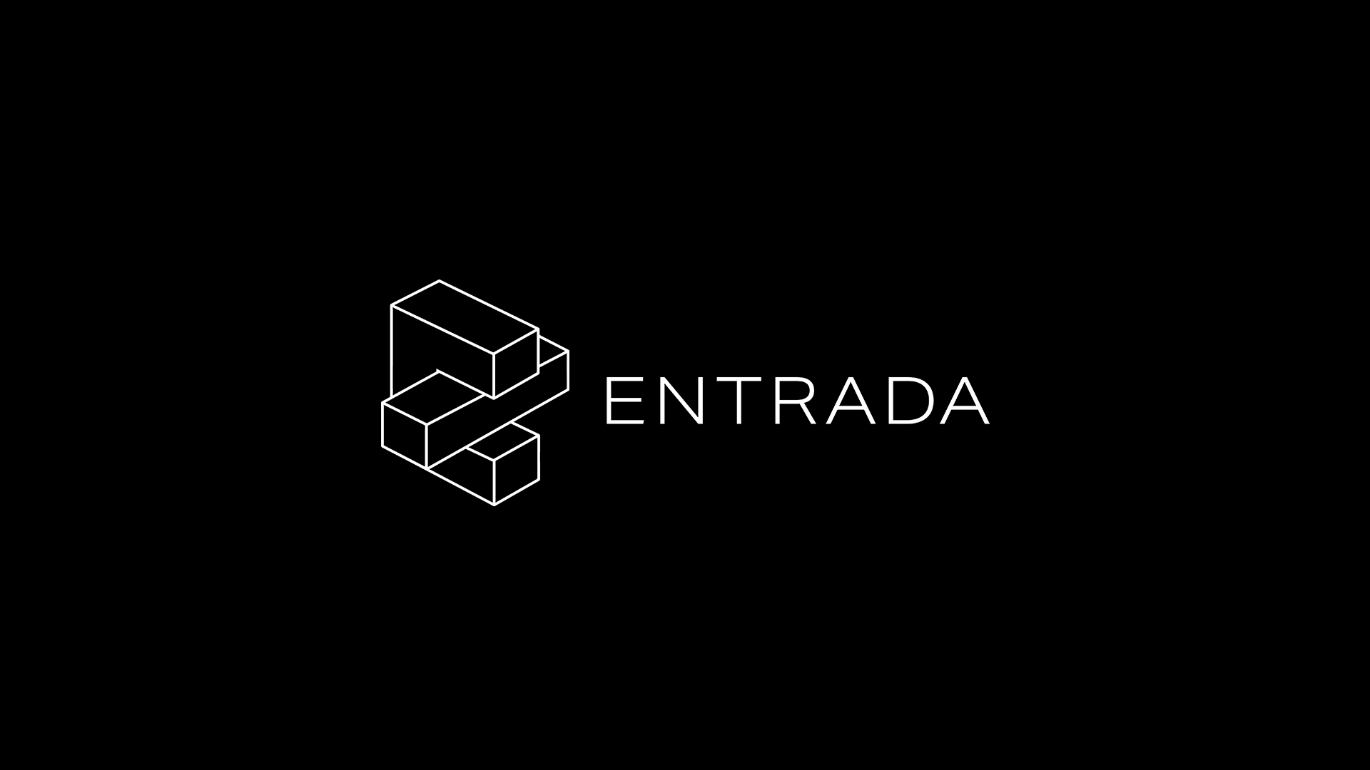
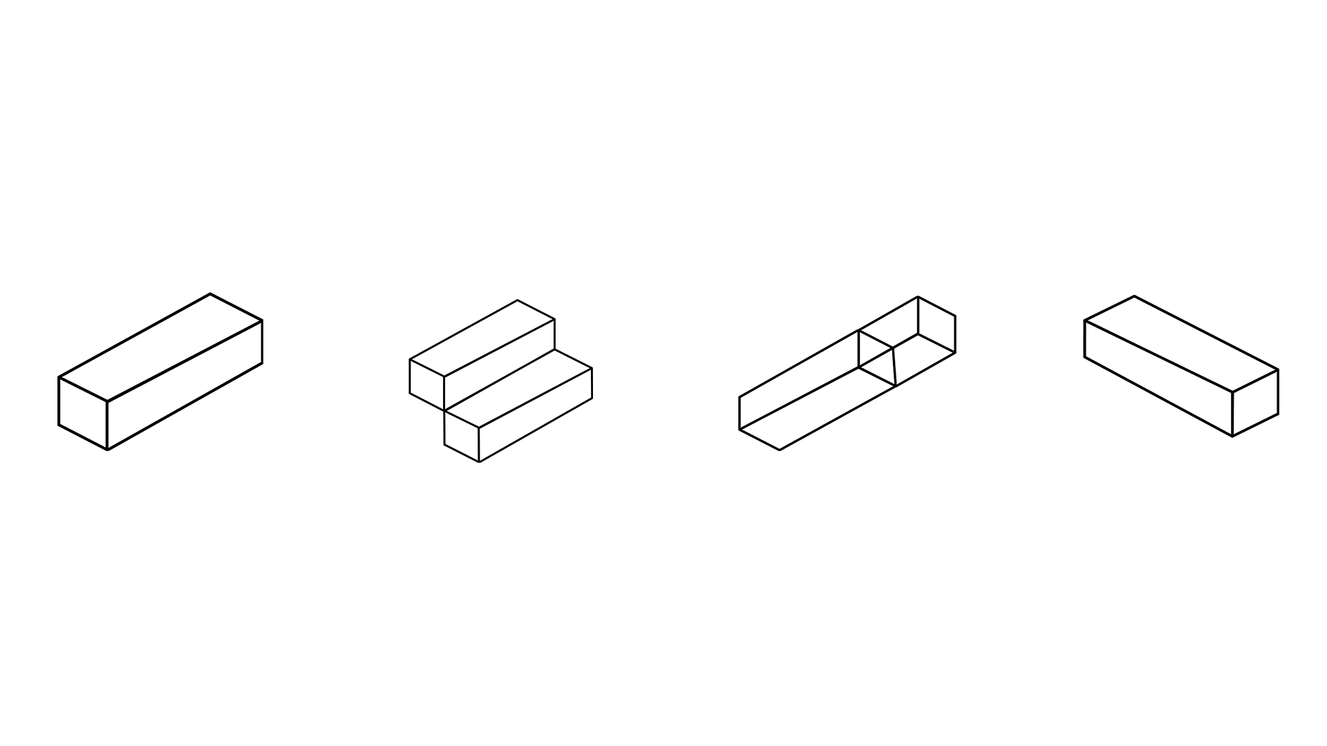
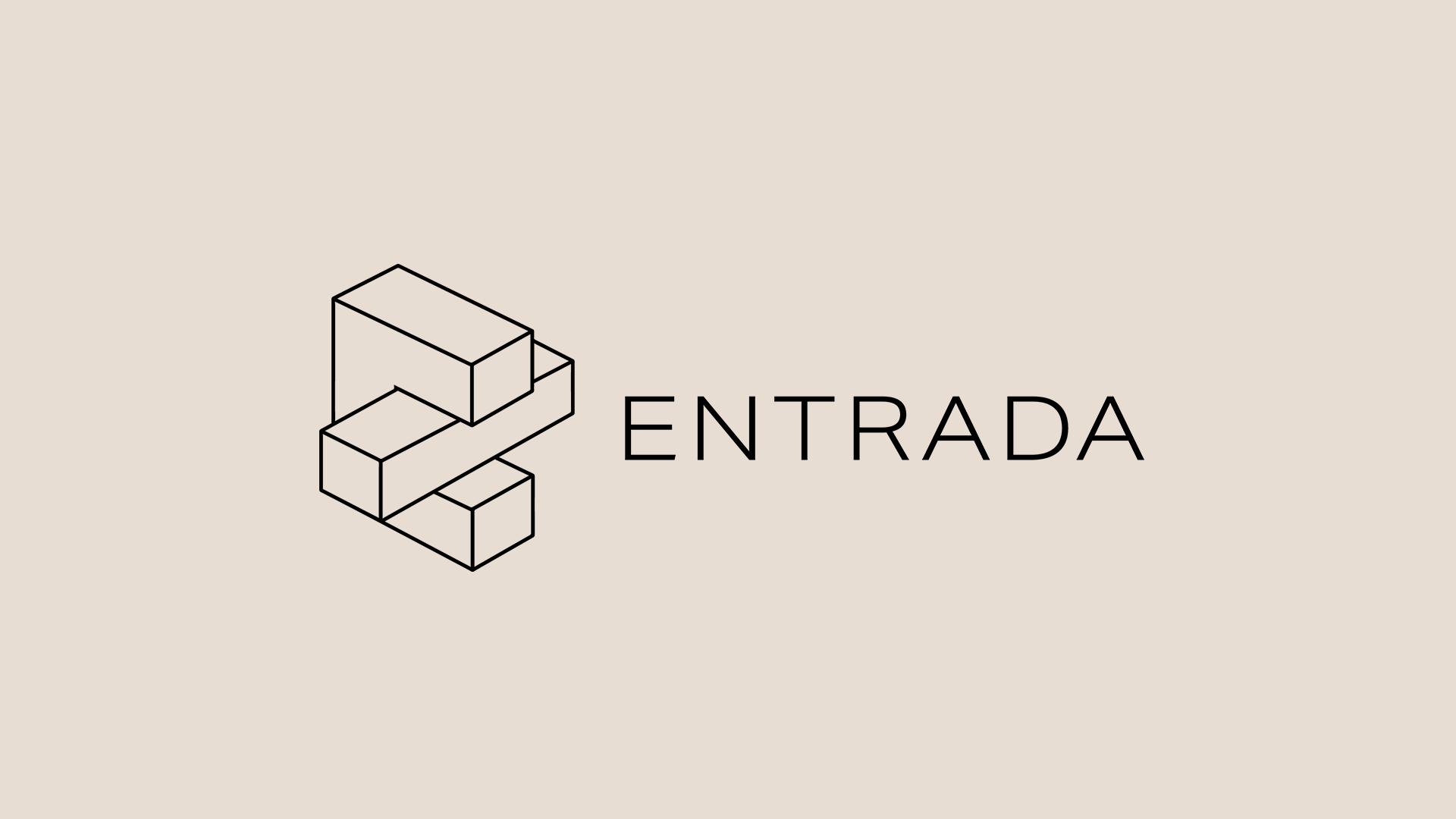
"A modern intersection." The mark is a dimensional "E" that has been deconstructed and reimagined to create a visual that represents disruption, agility, and movement. Yet, it is also represented in an elegant and clean manner with thin, clean, linear strokes. The mark also connects the origins of the ENTRADA name with a nod to the geological reference it was originally based on (a foundational stone).
"A modern intersection." The mark is a dimensional "E" that has been deconstructed and reimagined to create a visual that represents disruption, agility, and movement. Yet, it is also represented in an elegant and clean manner with thin, clean, linear strokes. The mark also connects the origins of the ENTRADA name with a nod to the geological reference it was originally based on (a foundational stone).
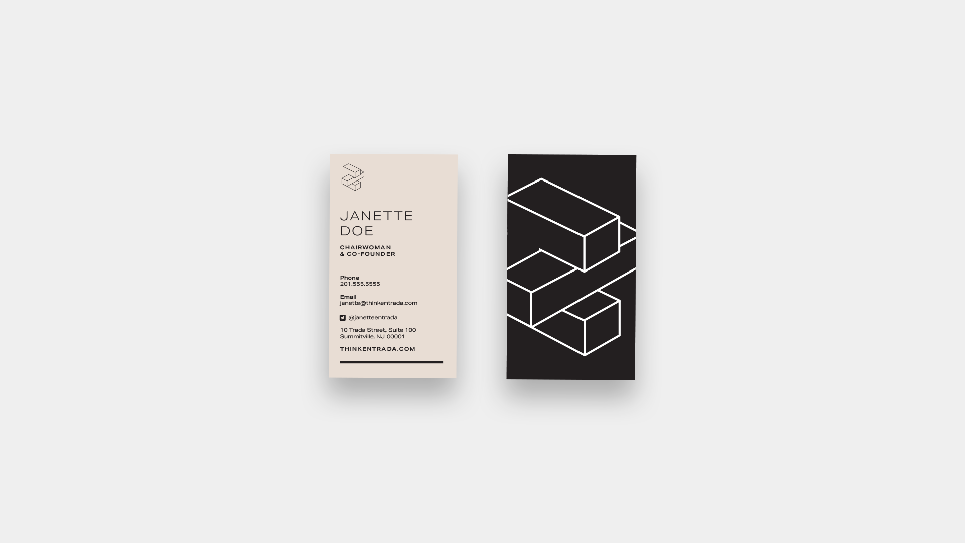
The new visual brand, website, and copy repositioned ENTRADA as the healthcare industry’s go-to partner for breakthrough strategic solutions and digital engagement.
My role
I successfully managed the entire project lifecycle, from the initial discovery and research phase to the final conceptual design and delivery. I ensured all project goals and objectives were met within established timelines and budgets.
Completed during my tenure at Reit Design.